Why AI Is Changing the Way Australian Operators Run Their Week
The operations dashboard has existed in some form for as long as managers have been managing — a spreadsheet here, a printed report there, a Monday morning stand-up where someone reads numbers off a whiteboard. What AI has changed is not the concept of the dashboard; it is the quality, speed and relevance of what appears on it.
Today, AI-driven platforms can pull data from your point-of-sale, payroll, accounting and CRM systems simultaneously, identify patterns that a busy manager would never have time to find manually, and surface only the metrics that actually require attention. For Australian SME operators, this shift is significant. Rather than spending Sunday evening compiling figures for a Monday meeting, your managers can arrive at that meeting already knowing *which* location underperformed, *why* labour costs spiked, and *what* to do about it.
The [Productivity Commission](https://www.pc.gov.au) has consistently highlighted that productivity gains for Australian businesses are most accessible through better use of existing technology and data. AI-powered management reporting is exactly that kind of gain — not a wholesale transformation, just a smarter use of what you already know.
What Makes an Operations Dashboard Actually Useful?
Most dashboards fail for one of two reasons: they show too much, or they show the wrong things. A dashboard crammed with 40 metrics is just a noisier version of the spreadsheet problem. A dashboard that only tracks revenue without watching margins, staffing costs or customer retention misses the signals that matter most.
An effective weekly operations dashboard should answer three practical questions for every manager who opens it:
- Where did we perform well this week, and why?
- Where are we at risk, and how serious is it?
- What requires a decision or action before next week?
If your current reporting cannot answer those three questions clearly within two minutes, it is working against your team, not for them.
Outcome 1 — Freeing Up Staff Time Through Automated Reporting
Manual reporting is one of the most persistent hidden costs in Australian operations. Managers who spend three to five hours each week compiling data from separate systems are not managing — they are administrating. That time has a real cost, and in a tight labour market, it is a cost most operators cannot afford.
AI-powered weekly reporting eliminates the compilation step entirely. When your POS, rostering and accounting systems feed into a single platform, the dashboard builds itself. Your managers receive a structured, consistent report every Monday morning — not because someone assembled it, but because the system did.
This has a second benefit: consistency. Human-compiled reports vary depending on who prepared them and how much time they had. Automated reports apply the same logic every week, making period-on-period comparisons genuinely reliable.
Outcome 2 — Catching Problems Before They Compound
Early warning is where AI earns its place in operations management. Margin leaks, rising staff turnover, cash flow shortfalls and compliance gaps rarely appear suddenly — they develop gradually, and they are easy to miss when you are looking at weekly snapshots in isolation.
AI-driven dashboards track trends across weeks and months, not just the current period. They can flag when a location's gross margin is drifting downward across three consecutive weeks, when a particular employee cohort is showing early signs of disengagement, or when forward bookings suggest a cash-flow gap is forming in six weeks' time.
The [Fair Work Ombudsman](https://www.fairwork.gov.au) regularly highlights that payroll underpayment issues — many of which arise from genuine complexity rather than bad intent — are among the most common compliance risks facing Australian employers. An operations dashboard that monitors award-rate compliance alongside rostered hours and actual pay gives managers a fighting chance of catching these discrepancies before they become formal complaints.
Outcome 3 — Capitalising on What Is Already Working
Most management reporting focuses on problems. An equally important function of a well-designed operations dashboard is to make your strengths visible and repeatable.
Which product lines are generating your strongest margins? Which team members are consistently driving upsells or repeat visits? Which locations are outperforming on customer satisfaction, and what can other sites learn from them? Which customer segments are your most loyal, and are you investing enough to keep them?
AI benchmarking — particularly when measured against [ABS](https://www.abs.gov.au) industry classifications — gives you a reference point beyond your own history. Knowing that your labour-cost percentage sits comfortably below your ANZSIC peer group, or that your revenue-per-employee outperforms the sector median, is genuinely useful strategic information, not just a number.
How Corvana Applies AI to Operations Dashboards
Corvana is designed specifically for this kind of operational intelligence. It connects directly to the systems Australian SME operators already run — including Xero, MYOB and QuickBooks for accounting; Square, Lightspeed, Kounta and Shopify for point-of-sale; Deputy, Tanda and Employment Hero for rostering and payroll; and HubSpot, Salesforce and Mailchimp for CRM.
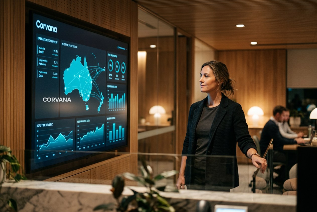
Rather than asking your managers to log into six platforms and synthesise the results themselves, Corvana unifies all of that data into a single live dashboard. AI-driven forecasting models project cash flow, demand and staffing needs forward, so your team is managing ahead of the week rather than reacting to it.
Automated weekly reporting means every manager receives a structured, consistent briefing without anyone having to prepare it. Industry-specific roles and permissions mean the site manager sees what is relevant to their location, while the general manager sees the consolidated view — and the finance lead sees the margin and compliance data they need, without wading through operational detail.
Customer lifetime value tracking and churn early-warning signals help operators protect their most valuable relationships before those customers quietly drift away.
Frequently Asked Questions
How many KPIs should a weekly operations dashboard actually include?
There is no universal number, but most effective dashboards focus on between eight and fifteen metrics per role — enough to give a complete picture without creating decision fatigue. The key is to separate "monitoring" metrics (things you watch but only act on if they deviate) from "action" metrics (things that always require a response if they move). A good AI platform will help you identify which is which based on your actual data patterns.
Our managers are not data people — will they actually use a dashboard?
This is the right question to ask before investing in any reporting tool. The dashboards most likely to be used consistently are the ones that are role-specific, visually simple, and delivered proactively — rather than requiring someone to log in and remember to look. Automated weekly summary reports sent directly to a manager's inbox, highlighting only what changed and what needs attention, tend to get far higher engagement than self-serve portals that require initiative to access.
How does benchmarking against industry data help us as an operator?
Benchmarking gives your internal numbers external context. Knowing your wage cost is 32% of revenue is interesting; knowing whether that is high, low or typical for your industry category — based on ABS or ANZSIC classifications — is actionable. It helps you set realistic targets, prioritise improvement areas and make a more credible case to lenders, investors or potential buyers.
---
If you would like to see how Corvana brings all of this together for your business, we would be glad to walk you through it.